



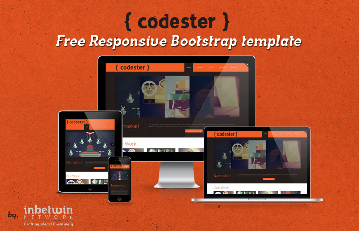
Codester: Free Responsive Bootstrap Template
In our last post we have listed responsive grid framework and in the end of the post we mentioned that we will be bringing you a responsive bootstrap template as a freebie. So with keeping the promise today we would like introduce you to our first bootstrap template.
About Bootstrap
Bootstrap is responsive grid framework or say toolkit to fasten the frontend prototyping and also building the production ready web application. It really help out the frontend designer to prototype his responsive web project. In recent days bootstrap has proved to be a complete toolkit to create a beautiful web app faster and easily.
It actually comes up with many add-ons and plugins which makes it interactive, easy to customize, upgradable and flexible enough to extend it to the desired level.
About Codester
Codester is basically a portfolio template for creative people like designers, photographers, graphics artists and more. But with some basic customization you can actually transform this template into your desired website. Codester comes with complete customizable package including latest JavaScript, Scaffolding, Base CSS and Components.
We designed and developed this free template completly on the basics of Bootstrap framework. In includes all the functionality of bootstrap template. Following are some of the features of this template:
- Responsive design
- Compatible with all major browsers
- Compatible with mobile and tablet screen sizes
- Completely functional Contact form
- Included search functionality
- Included search functionality
- Beautiful portfolio gallery
- Included Blog layout
- Beautiful Accordion image slider on home page
- Flexible
- Completely customizable.
- Add-on by Template Monster
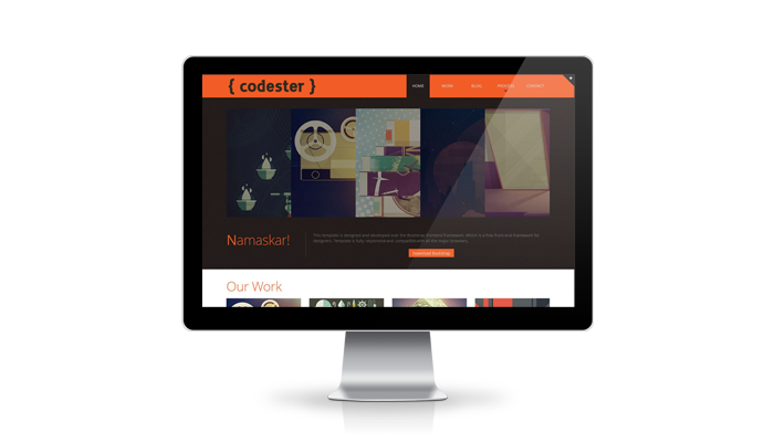
Desktop Preview
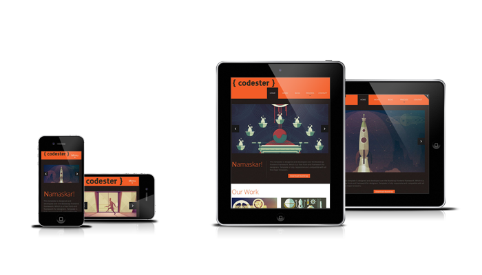
Iphone, Tablet preview
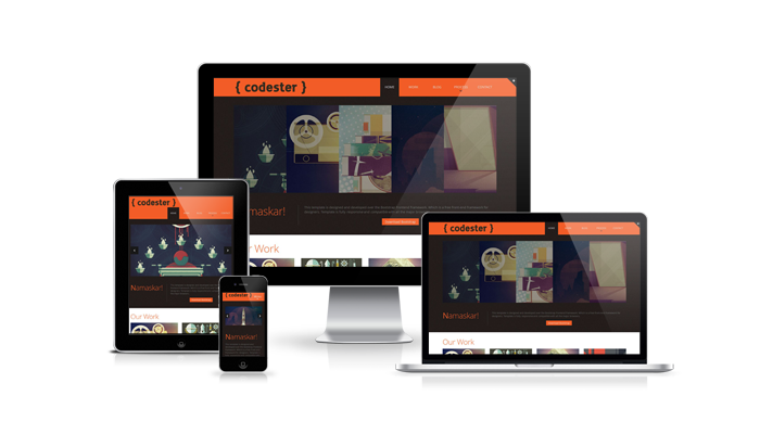
All media preview
You can download the template here and that’s also absolutely free! Don’t forget to subscribe us via socials to be updated on our latest articles, useful tutorials, creative freebies and inspirational stuff.



Awesome, wicked template! Cheers
Thanks Tania,
Appreciation always foster confidence.
Where are the Demo- and Download-Links?
You will find the demo and download link behind the Twitter follow block.
You can close it or follow us on twitter to unlock the link.
Let us know once you successfully see the demo and download links or you find some trouble.
Wow. What a gorgeous design. Thank you for posting it in the Freebies.
Really nice! Thanks for the generosity! Good karma is coming your way.
Hey! How do I remove the bootstrap navbar on top? I don’t see any HTML?
Hello Vignesh,
To hide the bootstrap navbar, go to docs.css which is located in CSS folder.
Open the file and go to line no 44 or search the class #panel #advanced
Add a css property as
display:noneand you are done!Awesome design cheers.
I would like to change the images in the main carousel to slide instead of fade, which file would I need to edit to do this?
Cheers
Hello Richard,
All those carousel to slide switching is handled using the media queries.
To make the images slide you just have change the min and max media screen
in css/kwicks-slider.css file.
Just search and replace this line
@media handheld, only screen and (min-width:1300px)with@media handheld, only screen and (min-width:1900px)and
@media only screen and (max-width:1299px)with@media only screen and (max-width:1899px)PS: Considering the screen size 1899px max upto which images will slide and navigation will be visible.